Selecting the Right Color Palette for a Red Brick Fireplace Accent Wall
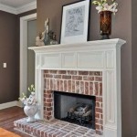
A red brick fireplace accent wall is a classic architectural feature that can add warmth and character to a living space. However, choosing the right paint colors to complement the brick is crucial for creating a cohesive and visually appealing design. The inherent warmth and texture of red brick can be both an advantage and a challenge when selecting a color palette. The goal is to find colors that enhance the brick's beauty rather than clash with it, creating a harmonious and balanced aesthetic.
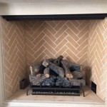
The color of the red brick itself is the starting point for color selection. Red brick is not a monolithic color; it encompasses a range of shades, from deep burgundy to lighter terracotta hues. It may also contain variations in tone, including hints of brown, orange, or even gray. Identifying the dominant color and undertones present within the brick is essential for choosing compatible paint colors for the surrounding walls. This involves a careful assessment of the brick’s specific shade and characteristics under different lighting conditions. Natural daylight, artificial light, and the room's overall ambience can all affect how the brick appears.
Once the specific characteristics of the brick are understood, different color schemes can be explored, considering factors like room size, natural light, and desired mood. The best color choices will not only complement the brick but also contribute to the overall atmosphere and functionality of the space.
Neutral Color Schemes for Versatility and Balance
Neutral colors are frequently chosen for rooms with red brick fireplaces due to their inherent versatility and ability to create a calming backdrop. These colors, including shades of white, gray, beige, and greige, offer a subtle contrast to the boldness of the red brick, allowing the fireplace to remain the focal point without overwhelming the space. The specific neutral shade should be carefully selected to harmonize with the undertones present in the brick. For example, if the brick has warm undertones, a creamy off-white or a warm beige can enhance its richness. Conversely, if the brick has cooler undertones, a light gray or a cool greige can provide a sophisticated contrast. The use of neutral colors also allows for greater flexibility in incorporating other decorative elements and furniture, ensuring that the overall design remains balanced and adaptable to changing tastes.
Variations within neutral color schemes can add depth and visual interest to the room. Layering different shades of the same neutral color can create a subtle gradient effect, highlighting architectural details and preventing the space from feeling monotonous. For instance, using a light beige on the walls and a slightly darker beige on the trim can add dimension without detracting from the fireplace. Furthermore, incorporating textured neutral fabrics and accessories can enhance the tactile quality of the room and contribute to a sense of warmth and comfort. The use of neutral colors also provides a versatile canvas for showcasing artwork, photographs, and other decorative items, allowing them to stand out against a subdued backdrop.
Complementary Color Schemes for Boldness and Drama
For those seeking a more dramatic and visually striking effect, complementary color schemes can be employed. Complementary colors are those that sit opposite each other on the color wheel, creating a strong contrast when used together. For red brick, the complementary color is green. However, the exact shade of green must be carefully chosen to avoid clashing with the brick. Earthy greens, such as olive green or sage green, tend to work well with red brick fireplaces, creating a natural and organic feel. These greens also evoke a sense of tranquility and harmony, balancing the boldness of the red brick. The intensity of the green should be considered in relation to the size of the room and the amount of natural light available. Darker greens can create a cozy and intimate atmosphere, while lighter greens can brighten up the space and make it feel more open.
In addition to green, other complementary colors, such as teal or turquoise, can be used to create a more modern and eclectic look. These colors offer a refreshing contrast to the warmth of the red brick, adding a touch of sophistication and elegance. When using bolder complementary colors, it is important to exercise moderation and balance. The complementary color should be used as an accent, rather than dominating the entire space. This can be achieved by incorporating the color through accessories, artwork, or a single accent wall. The key is to create a visual harmony between the red brick and the complementary color, ensuring that neither overwhelms the other. Proper lighting can also enhance the effect of complementary colors, highlighting their individual nuances and creating a dynamic and visually engaging space.
Analogous Color Schemes for Harmony and Cohesion
Analogous color schemes involve using colors that are adjacent to each other on the color wheel. In the case of red brick, analogous colors include shades of orange, brown, and yellow. These colors create a harmonious and cohesive feel, as they share similar undertones and blend seamlessly together. Using analogous colors can enhance the warmth and richness of the red brick, creating a cozy and inviting atmosphere. Shades of terracotta, rust, and ochre can be used to complement the brick, adding depth and visual interest to the room. The specific shades should be chosen carefully to ensure that they harmonize with the brick’s specific color and undertones. Lighter shades can be used to brighten up the space, while darker shades can create a more intimate and dramatic feel. The use of analogous colors can also create a sense of continuity, blurring the boundaries between the fireplace and the surrounding walls.
Variations within analogous color schemes can add depth and complexity to the design. Layering different shades of orange, brown, and yellow can create a subtle gradient effect, highlighting architectural details and preventing the space from feeling monotonous. For instance, using a light terracotta on the walls and a slightly darker rust on the trim can add dimension without detracting from the fireplace. Furthermore, incorporating textured fabrics and accessories in analogous colors can enhance the tactile quality of the room and contribute to a sense of warmth and comfort. The key is to create a cohesive and balanced design, ensuring that the different shades complement each other and work together to enhance the beauty of the red brick fireplace. Proper lighting can also enhance the effect of analogous colors, highlighting their individual nuances and creating a harmonious and visually appealing space.

Dwelling Mn Let There Be Color Fireplace Accent Walls Red Brick Fireplaces

The Best Paint Colors To Go With A Brick Fireplace Kylie M Interiors

The Best Tan Paint Colour To Go With Red Toned Brick Fireplace Sherwin Williams Agreeable G Colors For Living Room Fireplaces

The Best Paint Colors To Go With A Brick Fireplace Kylie M Interiors

Designdecoridea Com Fireplace Design Red Brick Fireplaces Interior

The Best Paint Colors To Go With A Brick Fireplace Kylie M Interiors

What Goes With A Redbrick Fireplace

Red Brick Fireplace Design Ideas

Pin By David Bothof On Dining Living Rooms Paint Colors For Room Red Brick Fireplaces
:strip_icc()/oldchatham12-f64745fd3b5e4d139fa5ad80b3840112.jpg?strip=all "15 Cozy Brick Fireplace Ideas To Warm Up Your Space")
15 Cozy Brick Fireplace Ideas To Warm Up Your Space
Related Posts